Central tendency and variability

APA Style

Esteban Montenegro-Montenegro, PhD

Psychology and Child Development

Central tendency measures

  • In this lecture we will study several basic concepts, but don’t fool yourselves by thinking that these topics are less important.

  • These concepts are the foundations to understand what is coming in this class.

  • We will learn about several measures to describe and understand continuous distributions.

  • Remember that this are just a few measures, if time allows we will study more options to describe distributions.

  • Let’s focus on the most common type of average you’ll see in psychology:

\[\begin{equation} \bar{X} = \frac{\sum X}{n} \end{equation}\]

Where:

  • the letter X with a line above it (also sometimes called “X bar”) is the mean value of the group of scores or the mean.

  • the \(\sum\) or the Greek letter sigma, is the summation sign, which tells you to add together whatever follows it to obtain a total or sum.

  • the X is each observation

  • the \(n\) is the size of the sample from which you are computing the mean.7

Example

setwd("C:/Users/emontenegro1/Documents/MEGA/stanStateDocuments/PSYC3000/lecture5")

rum <- read.csv("ruminationComplete.csv")
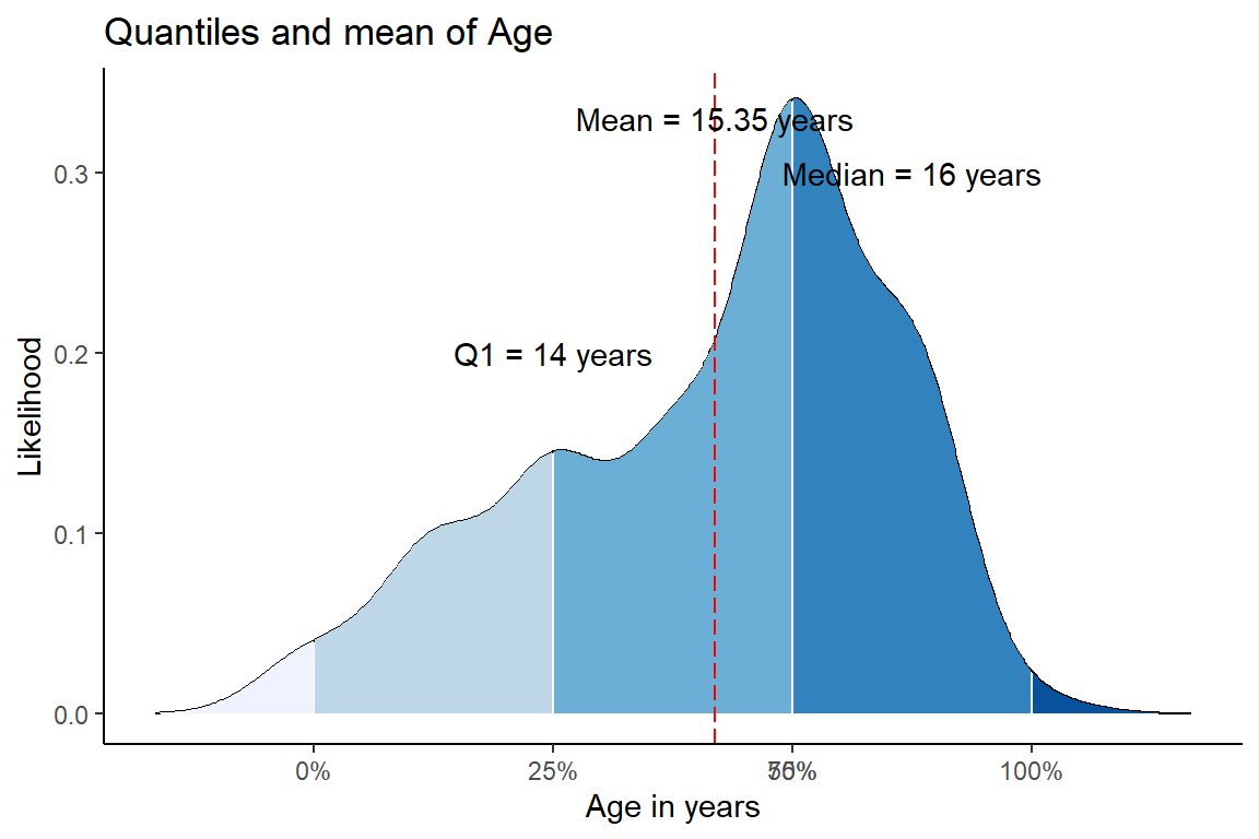
mean(rum$age)
[1] 15.34906

Note

We will use \(M=\) to represent the word mean

Central tendency measures III

Let’s do it by hand:

\[\begin{align} \bar{X} &= \frac{\sum X}{n}\\ &= \frac{18+21+24+23+22+24+25}{7}\\ &= \frac{157}{7}\\ &= 22.43\\ \end{align}\]

Central tendency measures III

  • Or we could do it in R:
(18+21+24+23+22+24+25)/7
[1] 22.42857

Central tendency measures IV

  • Median: The median is defined as the midpoint in a set of scores. It’s the point at which one half, or \(50%\), of the scores fall above and one half, or \(50%\), fall below.

  • To calculate the median we need to order the information. Let’s imagine you have the following values from different households:

$135,456 | $25,500 | $32,456 | $54,365 | $37,668
  • Now, we’ll need to sort the income from highest to lowest
$135,456| $54,365| $37,668| $32,456| $25,500
  • Which value is in the middle?

  • The median is also known as the 50th percentile, because it’s the point below which 50% of the cases in the distribution fall. Other percentiles are useful as well, such as the 25th percentile, often called Q1, and the 75th percentile, referred to as Q3. The median would be Q2.

Median to the rescue

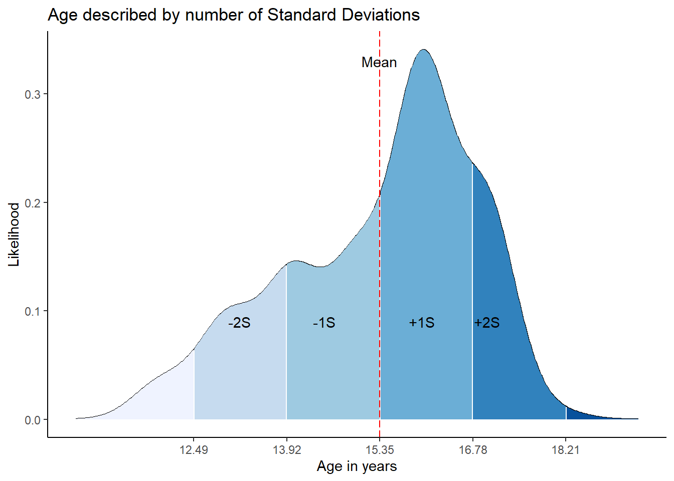
  • As you might remember, the mean is strongly affected by the extreme cases, whereas the median is more “robust” to extreme cases. This means the median is less affected by extreme values.

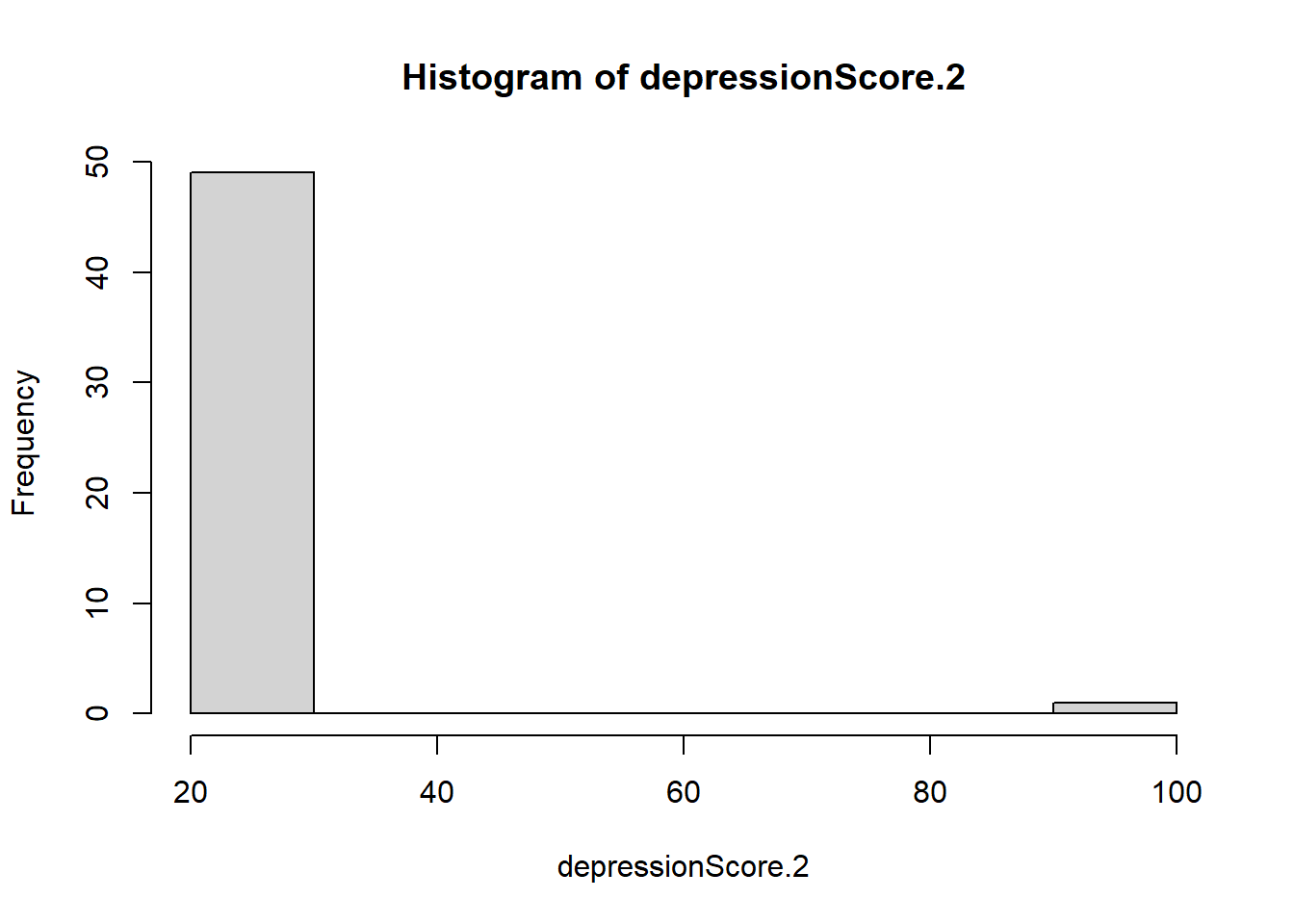
  • Let’s use simulation to find out if it is true, imagine you have data related to a depression score:

set.seed(1256)

M <- 25

SD <- 1

n <- 50

## Simulated depression score
depressionScore <- rnorm(n = n, mean = M, sd = SD)

hist(depressionScore)
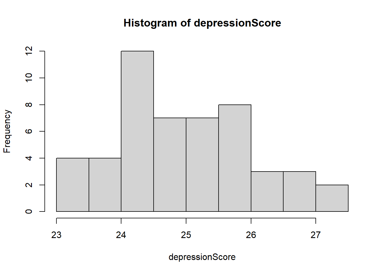
  • Let’s check the mean of these generated values:
mean(depressionScore)
[1] 24.97403
  • Now, let’s add a very extreme case, imagine one person has a diagnosis of bipolar disorder, and that person is experiencing a depressive episode when she or he filled out your test:
depressionScore.2  <- depressionScore 
depressionScore.2[50] <- 100
hist(depressionScore.2)

  • Let’s compare the mean on both cases:
cat("Mean before the extreme case:", mean(depressionScore))
Mean before the extreme case: 24.97403
cat("Mean after the extreme case:", mean(depressionScore.2))
Mean after the extreme case: 26.48716
  • We can check now if the median was heavely affected by th extreme case:
cat("Median before the extreme case:", median(depressionScore))
Median before the extreme case: 24.82834
cat("Median after the extreme case:", median(depressionScore.2))
Median after the extreme case: 24.89818
  • Great the median is robust enough! It remain practically intact!

The fashionable Mode

  • The mode is the value that occurs most frequently. There is no formula for computing the mode.

To compute the mode, follow these steps:

  1. List all the values in a distribution but list each value only once.
  2. Tally the number of times that each value occurs.
  3. The value that occurs most often is the mode.
table(rum$grade)

 7  8  9 10 11 
30 25 24 72 61 
  • The most frequent grade is 10th, therefore the mode is 10th grade.

Note

The function table() helps to calculate frequencies, this means; how many times a value appears in our data. It looks ugly, but it is helpful. The first row are the values observed in the data, and the second row are the frequencies.

The fashionable Mode II

  • However, things can get messy when you have two modes!
  • When you have a bimodal distibution you are dealing with a mixture of two or more distributions.

Summary() function as a good option

  • In R we can count on a handy function to describe a distribution, this function is summary().
summary(rum$age)
   Min. 1st Qu.  Median    Mean 3rd Qu.    Max. 
  12.00   14.00   16.00   15.35   16.00   18.00 
  • This function shows the minimum value, the 1st quantile, the median, the 3rd quantile, mean and maximum value.
library(ggplot2) ### package to create pretty plots

dens <- density(rum$age)

df <- data.frame(x=dens$x, y=dens$y)

probs <- c(0, 0.25, 0.5, 0.75, 1)

quantiles <- quantile(rum$age, prob=probs)

df$quant <- factor(findInterval(df$x,quantiles))

figure <- ggplot(df, aes(x,y)) + 
    geom_line() + 
    geom_ribbon(aes(ymin=0, ymax=y, fill=quant)) + 
     scale_x_continuous(breaks=quantiles) +
     scale_fill_brewer(guide="none") + 
     geom_vline(xintercept=mean(rum$age), linetype = "longdash", color = "red") +
     annotate("text", x = 14, y = 0.2, label = "Q1 = 14 years") +
     annotate("text", x = 17, y = 0.3, label = "Median = 16 years") +
     annotate("text", x = 15.35, y = 0.33, label = "Mean = 15.35 years") +
     ylab("Likelihood") + 
     xlab("Age in years")+
     ggtitle("Quantiles and mean of Age")+
     theme_classic()
figure

Time to talk more about variability

  • In psychology we love variability, this is true also for science itself!

  • We care a lot about variability, the whole point of doing research is to explain or observe how variability happens. For instance, if you had data about life expectancy in the world you could detect which cases are far from the mean. Wait! We do have this type of data, check this webpage from the World Bank.

  • According to the World Bank the global life expectancy at birth is 73 years old.

  • We could use the World Bank map and think, well we could which countries are far from the mean, For example: Costa Rica is 80.47, that means that Costa Rica is (\(80.47-73 = 7.47\)) 7.47 expected years above the mean. That’s good, these people have longer life that many people in the world.

Time to talk more about variability II

  • Let’s check more information. In the next table:
library(dplyr)

Attaching package: 'dplyr'
The following objects are masked from 'package:stats':

    filter, lag
The following objects are masked from 'package:base':

    intersect, setdiff, setequal, union
library(DT)

life <- read.csv("lifeExpect.csv", header = TRUE) %>%
  select(Country.Name, Country.Code, X2020) %>%
  filter(!is.na(X2020))
##rmarkdown::paged_table(life)

datatable(life, filter = "top", style = "auto")

Time to talk more about variability III

  • According the table, countries such as Central African Republic, Chad, Lesotho, Nigeria, and Sierra Leone have the lowest life expectancy. Let’s see how far they are from the global mean.
lowLife <- life %>% 
  filter(Country.Code %in% c("CAF", "TCD", "LSO", "NGA", "SLE")) %>%
  mutate(difference = X2020 -73)

datatable(lowLife, filter = "top", style = "auto")

Time to talk more about variability IV

  • What we just did is called the absolute difference from the mean, and it is one of the variability measures we can use. Just by computing how far these countries are from the mean, we can draw worrisome conclusions. People are dying at a very young age in those places! And the difference compare to the World’s mean is up to 19.32 years less!

  • Following the same logic we could estimate something call variance, time to check some math formulas:

\[\begin{equation} s^2 = \frac{\sum (X_{i} - \bar{X})^2}{n-1} \end{equation}\]
  • In this formula \(X_{i}\) is each value you have in your observed distribution, in our example it would be the life expectancy of each country. The symbol \(\bar{X}\) represents the mean of your observed distribution or data (lowercase).

  • Can you see what we are doing? We are calculating the absolute difference from the mean, and secondly we square the difference, next we sum the result and divide it finally by \(n-1\).

  • But wait! What is \(n-1\)? Given that we are working with a possible sample out of infinite samples, \(n-1\) helps to account that we are not working with the data generating process itself, it is just one instance generated by the data process.

  • The variance is hard to interpret but itself, but it is a concept that will help you to understand other models.

  • This concept is a measure of variability that depends on the metric of your observations.

  • For instance, you cannot compare the variability in kilometers with miles.

Time to talk more about variability V

  • Let’s use the data set called mtcars already included inside R, you don’t have to import any data set into R:
datatable(mtcars, filter = "top", style = "auto")

Time to talk more about variability VI

  • We will convert miles per gallon to kilometers per liter, we just need to multiply 1 mpg by 0.425 km/l.
carsData <- mtcars %>% select(mpg) %>%
  mutate(kml = mpg*0.425)

datatable(carsData, filter = "top", style = "auto")

Time to talk more about variability VII

  • We can try to compare the variance of miles per gallon and kilometers per liter:
## Variance mpg
cat("Miles per gallon variance:", var(carsData$mpg))
Miles per gallon variance: 36.3241
### Variance kml
cat("kilometers per liter variance", var(carsData$kml))
kilometers per liter variance 6.561041
  • If we were very naive, we would conclude that miles per gallon has more variance compare to kilometers per liter, just because the estimation gives a larger number this conclusion would be wrong.

  • The variance looks larger because the measurement unit has larger numbers, compare to km/l.

  • When you compare variances you need to compare apples to apples, both variables should follow the same units.

The Standard Deviation will be a better horse

  • The standard deviation is an improved measure to describe continuous distribution.

  • It is the average distance from the mean. The larger the standard deviation, the larger the average distance each data point is from the mean of the distribution, and the more variable the set of values is.

\[\begin{equation} s = \sqrt{\frac{\sum (X_{i} - \bar{X})^2}{n-1}} \end{equation}\]
  • The good thing about the standard deviation is that now we can compare different distributions and answer questions such as: which distribution has more variability? In simple words, we can conclude which distribution has values further away from the mean.

The Standard Deviation will be a better horse II

  • As always we can study an example:

    • Remember when we were simulating data days ago? Well, we’ll do it again!

Hospital Example

library(ggplot2) ### <- this is a package in R to create pretty plots.

set.seed(359)

### Non-hospital observations 
### Mean or average in Kg 
Mean <- 65
## Standard Deviation
SD <- 1
## Number of observations
N <-  300
### Generated values from the normal distribution
data_1 <-  rnorm(n = N, mean = Mean, sd = SD )
data_1

### Hospital group
### Mean or average in Kg 
Mean <- 90
## Standard Deviation
SD <- 10
## Number of observations
N <-  300
### Generated values from the normal distribution
data_2 <-  rnorm(n = N, mean = Mean, sd = SD )
data_2


dataMerged <- data.frame(
  group =c(rep("College", 300),
           rep("Hospital", 300)),
  weight = c(data_1, data_2))

ggplot(dataMerged , aes(x=weight, fill=group)) +
  geom_density(alpha=.25) + 
  theme_bw()+
  labs(title = "College and Hospital Weight Density Function") + 
  xlab("Weight (kg)") + 
  ylab("p(y) or likelihood")
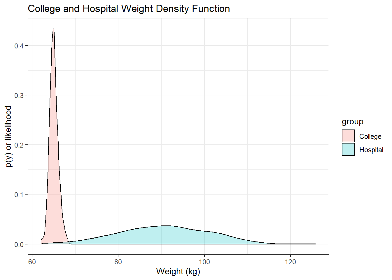
The Standard Deviation will be a better horse III

  • Thanks to the standard deviation, we have a measurement unit to describe better the data.

  • We could also know at what point we consider a case to be extreme or select observations above or below any specific value based on the standard deviation.

  • We can start from the mean and add or subtract standard deviations from the mean. For example, the mean of age in our rumination data set is 15.35 years old, the standard deviation is 1.43 years old.

The Standard Deviation will be a better horse IV

Let’s continue learning important concepts

  • I already mentioned the concept of “quantiles”, this concept is in fact related to probabilities.

  • We will revisit the household data presented before, but this time we’ll order the income starting from the lowest value up to the highest value:

$25,500| $32,456| $37,668| $54,365| $135,456
\[\begin{equation} \hat{y}_{(i-0.5)/n} = y_{(i)} \end{equation}\]
  • The little hat \(\hat{}\) on top of \(y\) means “estimate of”, this is used in statistics to comunicate that you are estimating a value form “data” (lowercase). This means you are estimating a value from your observed fixed data. The right-hand side is the \(ith\) ordered value of the data, all together we can read the formula as:

The \((i − 0.5)/n\) quantile of the distribution is estimated by the \(ith\) ordered value of the data

  • We can see an example:
Quantile example
\(i\) \(y(i)\) (\(i\)-0.5)/\(n\) \[\hat{y}_{(i-0.5)/n} = y(i)\]
1 25500 (1-0.5)/5 =0.10 25500
2 32456 (2-0.5)/5 =0.30 32456
3 37668 (3-0.5)/5 =0.50 37668
4 54365 (4-0.5)/5 =0.70 54365
5 135456 (5-0.5)/5 =0.90 135456
  • Then, we can say in plain English: “The 70th percentile of the distribution is measured by $54,365”.

  • Now notice something, why we don’t have data representing the 75th percentile?

  • Given that these are estimates , these numbers are approximations to the true value, If you collect more data you’ll have data in different percentiles, also more precision to capture the real value.

Cumulative Density Function (CDF)

  • We have been studied Probability Density Functions (PDF), now I’m going to introduce a concept that is related to PDF.

  • I said that the area under the curve of the PDF is actually probability, even though the y-axis is showing likelihood instead of probability.

  • I also said you can use calculus to get that probability in a easier way.

  • Those calculus formulas will give you an easy way to estimate the probability under that curve. The final result is something we call “Cumulative Density Function CDF”.

Cumulative Density Function (CDF)

  • As the name says, we are like “stacking” the whole density, therefore it changes the shape of the curve, but at the end is the same information in a different metric.

  • In fact, you get the derivative of a CDF, th calculation will give you the PDF back.

  • But no worries, I won’t ask you to do it… you are safe!

Cumulative Density Function (CDF)

  • All continuous distributions will have a CDF, and we are going to use very often the normal CDF.

  • The normal distribution is also called “Gaussian Distribution” , I prefer this name instead of “normal distribution”.

  • Anyhow, let’s check some properties here.

We can also understand the importance of the Gaussian CDF using R:

  • When we assume that the Gaussian distribution has a mean = 0 and standard deviation = 1, the CDF looks like this:
## sequence of x-values 
justSequence <- seq(-4, 4, .01)
#calculate normal CDF probabilities 
prob <- pnorm(justSequence)
#plot normal CDF 
plot(justSequence , 
     prob,
     type="l",
     xlab = "Generated Values",
     ylab = "Probability",
     main = "CDF of the Standard Gaussian Distribution")

abline(v=1.96, h = 0.975, col = "red")

  • We can see that the probability of observing a value less or equal than 1.96 is 0.975.

Cumulative Density Function (CDF) II

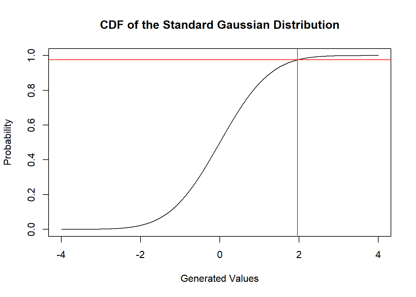
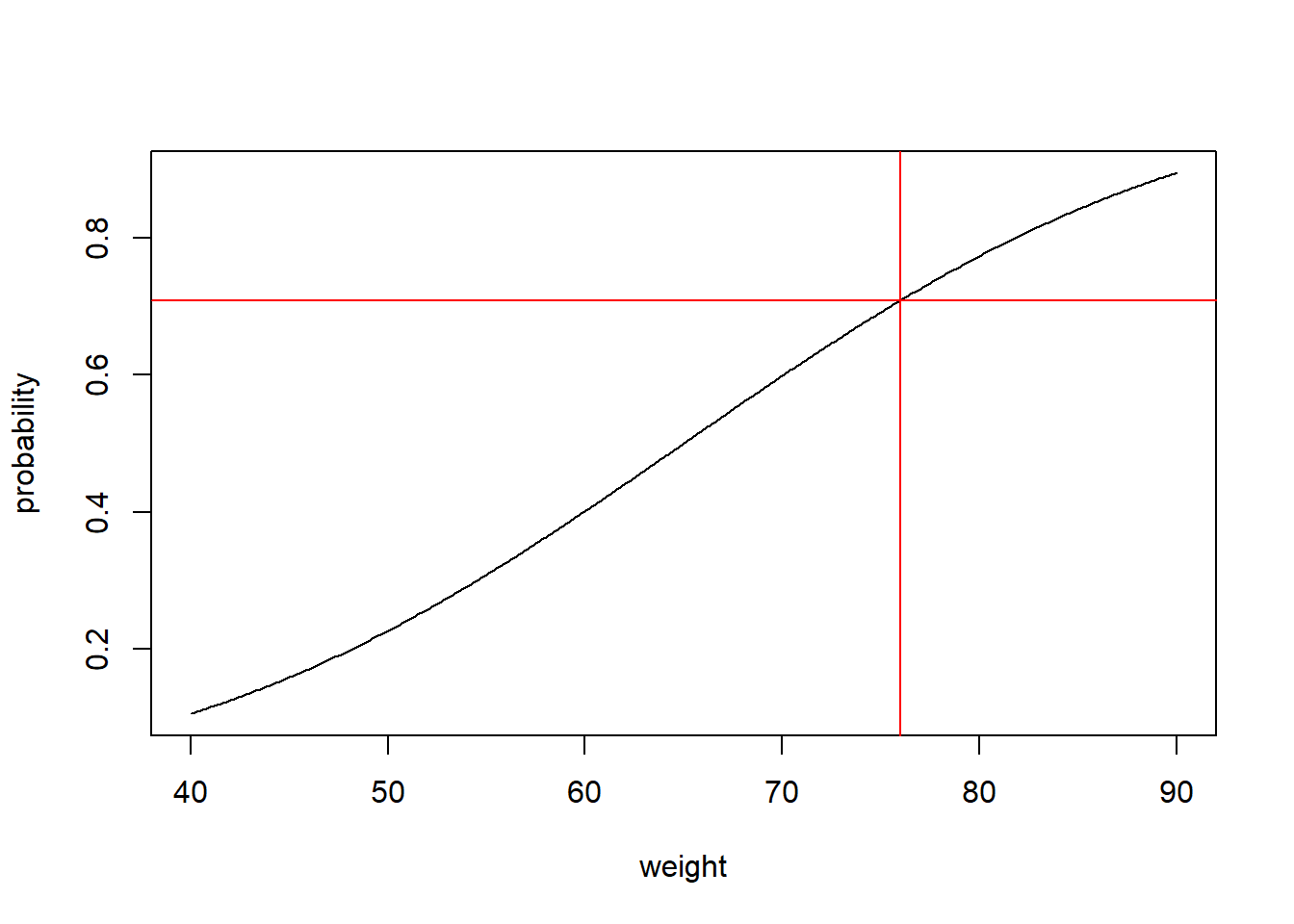
  • Let’s do something more intersting, remember the example of weight where we simulated the weight of two groups: hospital patients vs. college students?

  • We could now get the probability of observing a particular value.

  • Let’s imagine again that the distribution of weight among college students has a mean of 65 kg, and standard deviation of 20 kg.

weight <- seq(40, 90, 0.1)

probability <- pnorm(weight, 
                     mean = 65,
                     sd = 20)
plot(weight, 
     probability, type = "l")
abline(v=76, h =  0.7088403, col = "red")

  • A weight of 76 kg has a probability of 0.71, it is likely to see this weight in the college students under my assumptions.

Skewness

  • I left some concepts behind because I got excited talking about the CDF.

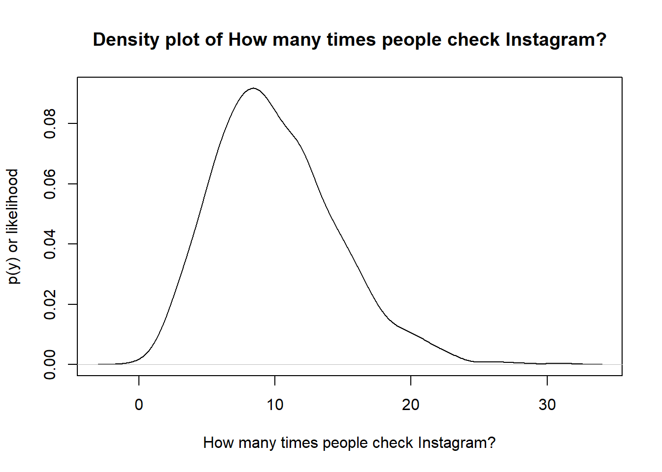
  • One important concept to describe a distribution is skewness.

Skewness II

  • We say that a distribution is right skewed when the tail is longer to the right:
set.seed(5696)

N <- 1000

### Number of times people check Instagram
weight <- rnbinom(N, 10, .5)

plot(density(weight, kernel = "gaussian" ),
     ylab = "p(y) or likelihood",
     xlab = "How many times people check Instagram?",
     main = "Density plot of How many times people check Instagram?")

  • We say that a distribution is left skewed when the left tail is longer:
set.seed(5696)

plot(density(rbeta(300,60,2)),
     ylab = "p(y) or likelihood",
     xlab = "Percentage of people who pass this class",
     main = "Density plot of Percentage of people who pass this class")

References

Westfall, P. H., & Henning, K. S. (2013). Understanding advanced statistical methods. CRC Press Boca Raton, FL, USA: