Data Visualization

The art of plotting

Author
Esteban Montenegro-Montenegro, PhD

Psychology and Child Development

Why figures are important?

  • In statistics we can add tables and explain our results, but a good graph will always help you to tell your story better.

  • It is a fast and easy way to comunicate several ideas in one single figure.

  • If you plot your values in the right way, you don’t need a lot of words to convey a message.

  • We are limited by our senses and biases, that’s why a plot helps to see the whole picture.

Why figures are important? II

  • In this lecture we will study briefly the most common plots to diagnose data and detect values that are extreme or a little bit odd.

  • I will also explain more about the package ggplot2 in R and details on how R creates plots.

Creating a good graph

  • Rules are always important:
    • Minimize chart or graph junk.
    • Plan out your chart before you start creating the final copy.
    • Say what you mean and mean what you say—no more and no less.
    • Label everything so nothing is left to the misunderstanding of the audience.
    • A graph should communicate only one idea.
    • Keep things balanced.
    • Maintain the scale in a graph.
    • Simple is best and less is more.
    • Limit the number of words you use.
    • A chart alone should convey what you want to say.

Let’s talk about histograms


- Let’s imagine those are scores from a test.

Let’s talk about histograms II

  • From the previuos table we could create class intervals and then count how many values can be classified in each class:

Let’s talk about histograms III

Let’s talk about histograms IV

  • Now, we can do it in R:
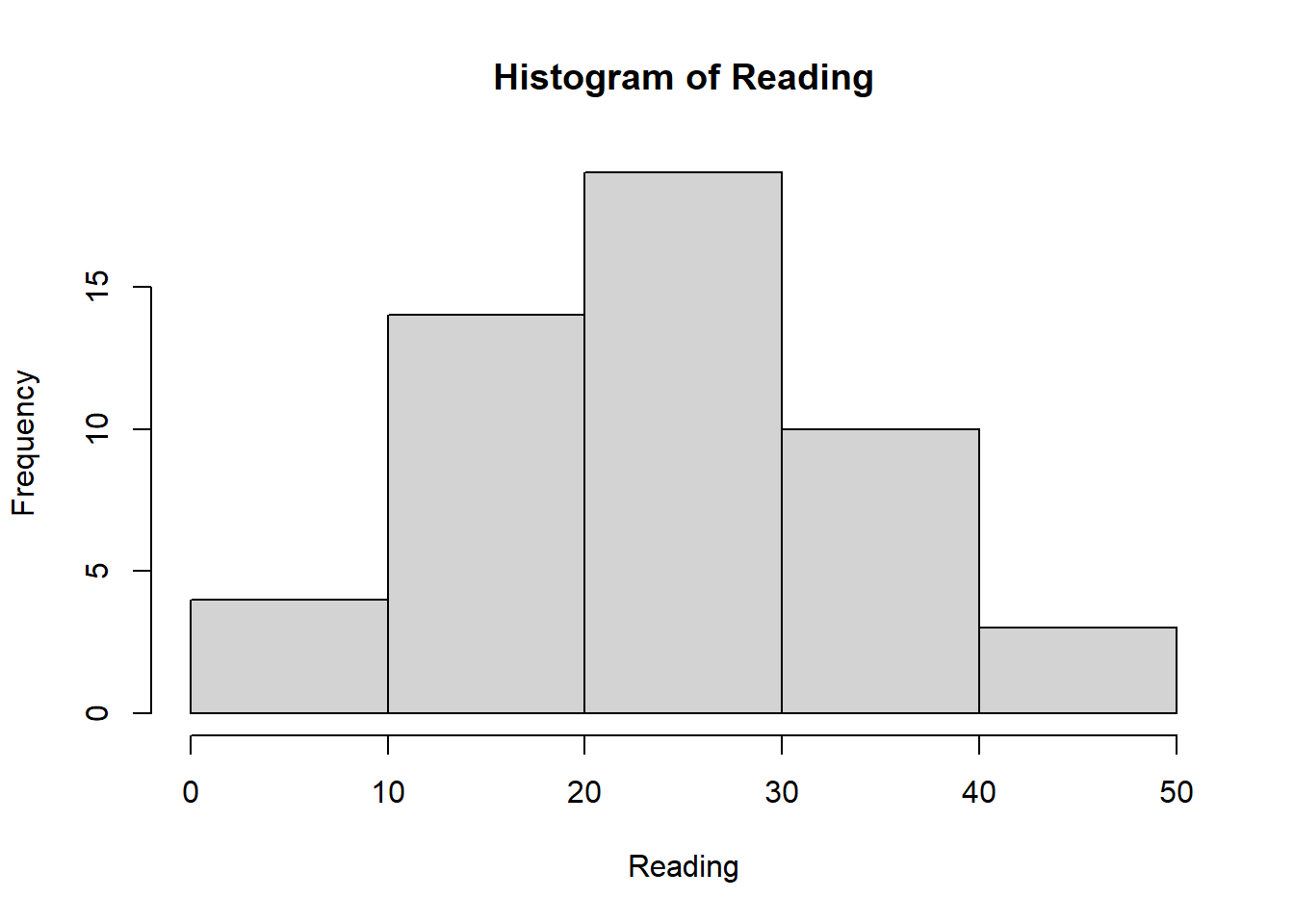
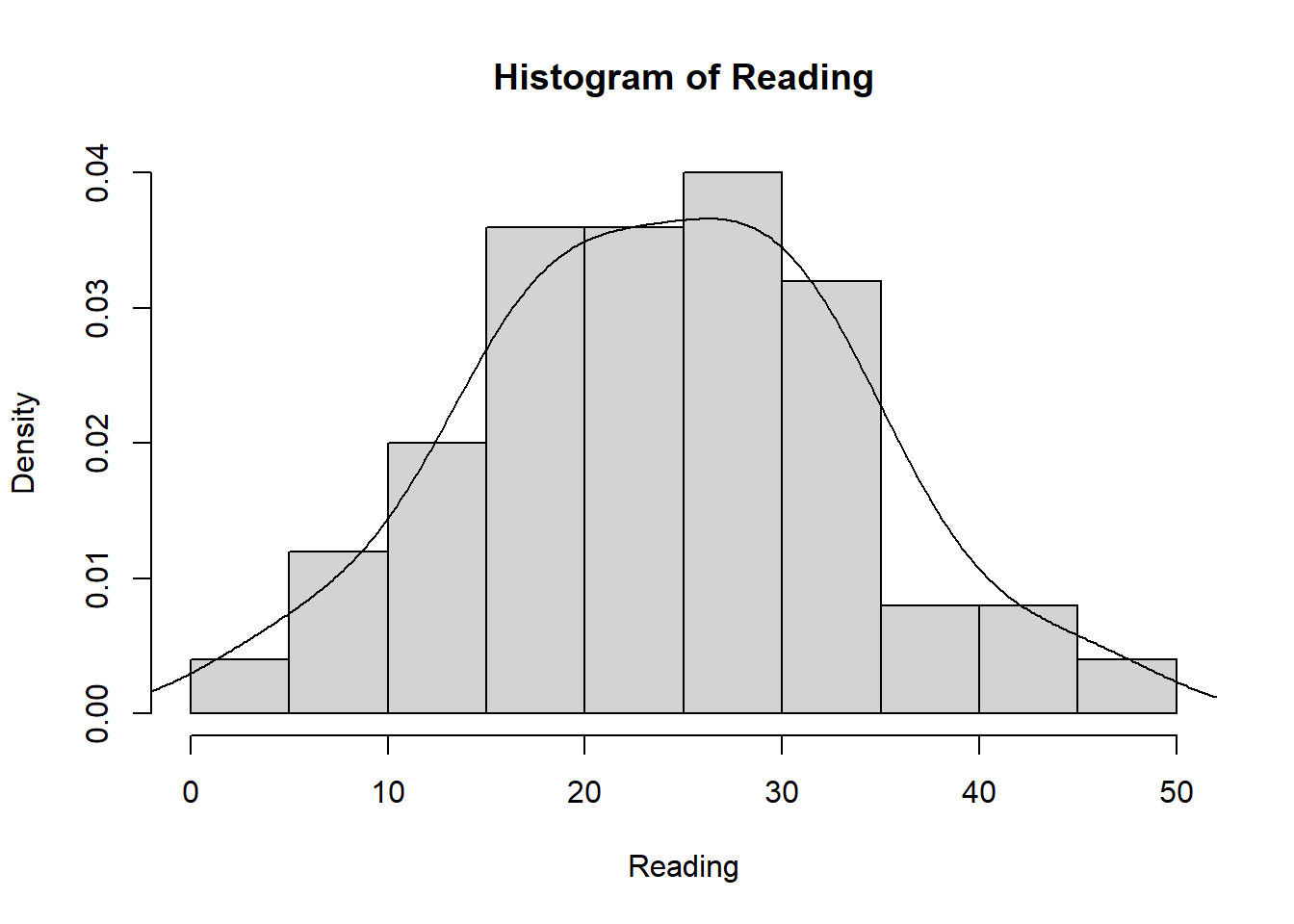
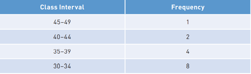
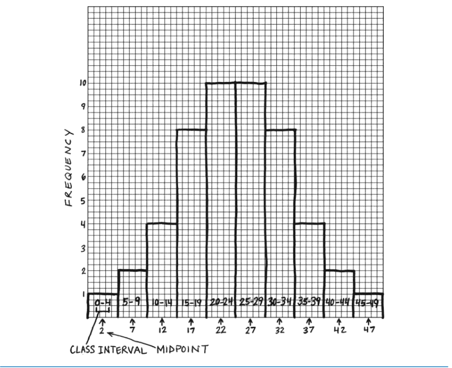
Reading <- c(47, 2, 44, 41, 7, 6, 35, 38, 35, 36,
            10, 11, 14, 14, 30, 30, 32, 33, 34, 32,
            31, 31, 15, 16, 17, 16, 15, 19, 18, 16,
            25, 25, 26, 26, 27, 29, 29, 28, 29, 27,
            20, 21, 21, 21, 24, 24, 23, 20, 21, 20)

hist(Reading)

  • We can change the number of class intervals:
hist(Reading, breaks = 5)

  • We can also add the Density Plot to the histogram:
 hist(Reading, probability = TRUE)
 lines(density(Reading))

There are many ways to get to the same point

  • As always in life, there are several ways to solve a problem or to reprensent an idea.

  • R has its own function to create plots, and probably you can recognize the function hist(), or the function plot(). In reality all the plots can be created only with R base functions.

  • But there is another way to create plots, which is using the package ggplot2.

  • As always, we need to check some documentation in this link.

ggplot2() package to create graphs

  • ggplot2() is a powerful package capable of doing amazing graphs ready to be publish.
  • The syntax that ggplot follows is known as “grammar of graphics”. Sounds fancy?
  • This package has some rules on how we can create plots.
  • We are going to review the basic rules to create a plot.

ggplot2() package to create graphs II

  • ggplot() does something called “mapping data”, this means that ggplot starts by linking your data with the graphics, it “maps” information into the picture.
  • In order to create a “map” of the data we use the following code:
library(ggplot2)

rum <- read.csv("ruminationComplete.csv")

ggplot(data = rum, aes(x=grade))

ggplot2() package to create graphs II

  • In the code, we are using a function named aes(), this stands for aesthetics. This means in simple English “appearance”. The function aes is creating a layout fo your data. That’s the first step.

  • After creating the layout, similar to an empty canvas, we will add layers

  • The layers are added by including the geometric form also known as geoms in ggplot2 grammar.

Time to add layers

  • geoms are the layers to create bar plots, pie charts, and many more types of figures:
    • The + sign is the glue that keeps the geom_bar() layer along with the mapped data
ggplot(data = rum, aes(x=grade)) + geom_bar()

Time to add layers II

  • You can also change the colors in other settings inside the layer:
ggplot(data = rum, aes(x=grade)) + geom_bar(fill = "blue")

Time to add layers II

  • The labels and text are also considered another layer, there are functions for changing the text:
  • Here we are changing the x-axis and y-axis labels.
ggplot(data = rum, aes(x=grade)) + 
  geom_bar(fill = "blue") +
  ylab("Counts of Students")+
  xlab("Grade")

Time to add layers III

  • There a good thing, ggplot() already has themes that you add to your plot, you don’t need to manipulate the appearance by yourself, in this case I’m adding the theme theme_classic().
ggplot(data = rum, aes(x=grade)) + 
  geom_bar(fill = "blue") +
  ylab("Counts of Students")+
  xlab("Grade") + 
  ggtitle("Bar Plot Example")+
  theme_classic()

We are in good shape to continue drawing!

  • Now, can resume were we left, we were talking about histograms.
  • In ggplot there is geom for each plot, in this case we can use the geom_hist():
ggplot(data = rum, aes(x=ageMonths)) + 
  geom_histogram(color="black", fill="white") +
  ylab("Counts")+
  xlab("Age in Months") + 
  ggtitle("Histogram of Age")+
  theme_classic()
`stat_bin()` using `bins = 30`. Pick better value with `binwidth`.

We are in good shape to continue drawing! II

  • There is another type of plot called “box plot” (whisker plot) , this type of plot is useful to detect extreme cases or outliers.

  • The line in the middle represents the median of the distribution, and the top line is the 75th percentile. The bottom line in the box represents the 25th percentile. See the anatomy of a bloxplot in this link.

We are in good shape to continue!

-Let’s do it in base R first:

boxplot(ageMonths ~ sex,
        data=rum, 
        main="Box Plot of Age by Sex",
   xlab="Sex", 
   ylab="Age in months",
   names = c("women", "men"))

We are in good shape to continue ! III

  • We can also do the same plot using ggplot2 package, in this case we add the geom_boxplot()
ggplot(data = rum, 
       aes(x=factor(sex), y=ageMonths)) + 
  geom_boxplot(fill = "orange") +
  xlab("Sex") +
  ylab("Age in Months")+
  ggtitle("Box Plot of Age by Sex") +
  scale_x_discrete(labels=c("Women", "Men"))+
  theme_classic()

We are in good shape to continue ! IV

  • Line plots are great for representing longitudinal data:
library(tidyr)
library(dplyr)
## Expectancy of life at birth from the World Bank
life <- read.csv("lifeExpect.csv") %>% 
  filter(Country.Name == "Costa Rica") %>%
  select(X1960:X2020) %>%
  pivot_longer(everything(), 
               names_to = "year", 
               values_to = "lifeYears")

lifeExpect <- as.numeric(gsub("X", "", life$year)) 

plot(x = lifeExpect,
     y = life$lifeYears, 
     type = "l",
     xlab = "Year",
     ylab = "Life expectancy at birth",
     main = "Life expectancy from 1960 to 2020 in Costa Rica",
     col = "blue",
     lwd = 3)

Attaching package: 'dplyr'
The following objects are masked from 'package:stats':

    filter, lag
The following objects are masked from 'package:base':

    intersect, setdiff, setequal, union

We are in good shape to continue ! IV

  • Line plots are great for representing longitudinal data, now let’s do it with ggplot2:
library(tidyr)
library(dplyr)
## Expectancy of life at birth from the World Bank
life <- read.csv("lifeExpect.csv") %>% 
  filter(Country.Name == "Costa Rica") %>%
  select(X1960:X2020) %>%
  pivot_longer(everything(), 
               names_to = "year", 
               values_to = "lifeYears")

lifeExpect <- as.numeric(gsub("X", "", life$year)) 

plot(x = lifeExpect,
     y = life$lifeYears, 
     type = "l",
     xlab = "Year",
     ylab = "Life expectancy at birth",
     main = "Life expectancy from 1960 to 2020 in Costa Rica",
     col = "blue",
     lwd = 3)

Note: Years in the X-axis is represented in 5 years interval

QQ-plots: Quantile-Quantile plots

  • Remember that we studied how to estimate the percentiles of a continous distribution? Now we will apply your knowledge to plots.

  • Quantile-Quantile plots will take the observed quantiles (or percentiles) from your observed data (lower case) and compare those quantiles versus a theoretical distribution.

  • Many times we want to test if our observed data comes from a normally distributed process, so we can take the theoretical normal quantiles and plot them against our observed quantiles.

  • Let’s see how life expectancy in Costa Rica looks like compare to a normally distributed process:

qqnorm(life$lifeYears, 
       pch = 1, 
       frame = TRUE,
        main = "Normal Q-Q Plot for Life Expentancy in Costa Rica")

qqline(life$lifeYears, col = "steelblue", lwd = 2)

  • If all the dots are align to the straight line we can assume the process that produces the data is normally distributed, in this case; what do you think?
set.seed(1236)

generatedValues <- rnorm(1000, mean = 0, sd = 1)

qqnorm(generatedValues, 
       pch = 1, 
       frame = TRUE,
        main = "Normal Q-Q Plot for Simulated data from a normal distribution")

qqline(generatedValues, 
       col = "steelblue", 
       lwd = 2)

  • The plot above shows what the QQ plot looks like when your observed data come from a normally distributed process.

References